【易寬設計 張華騫】屢獲國際大獎!藏身都市叢林中的咖啡店——SMILE COFFEE
- 加入收藏
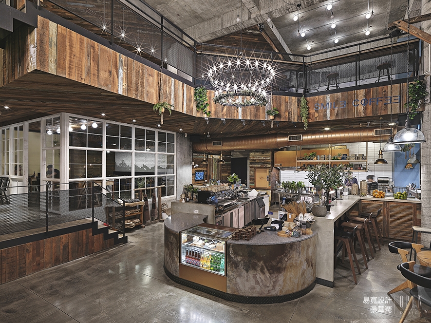
這是一間藏身都市喧囂中的咖啡店,業主希望呼應品牌理念,將丹麥的生活哲學「Hygge」置入其中,創造簡約舒適、溫暖樸實的情境氛圍。除此之外,它也是回歸自然、講究質感的代名詞,因此,易寬設計 張華騫 設計總監 連結建物外觀的豐富綠景及木紋清水模牆面,以最低限度的裝修呈現空間本質,搭造一處安放日常的美好寓所,讓前來覓食的訪客於此共享溫馨時光,感受平凡日常中的韶光暖意。 本文由OPEN編輯部撰寫
The low-profile coffee shop situated in the hustle and bustle city, which the shop owner expects to indicate the Danish living philosophy of "Hygge" into it that also echoes the brand concept, as well bring about a concise, comfy and heartwarming ambience. The designers merely exploit minimal modify to present the intrinsic quality of the space, so that not only lays out pristine but also delicate texture circumstance, thence shows up a charming environment for the daily life.
For the exterior, lead the plentiful green landscapes that conduce with the wood grain fair-faced concrete wall. Accordingly wish to grant the visitors who come for meals would having a warmth and delightful time.
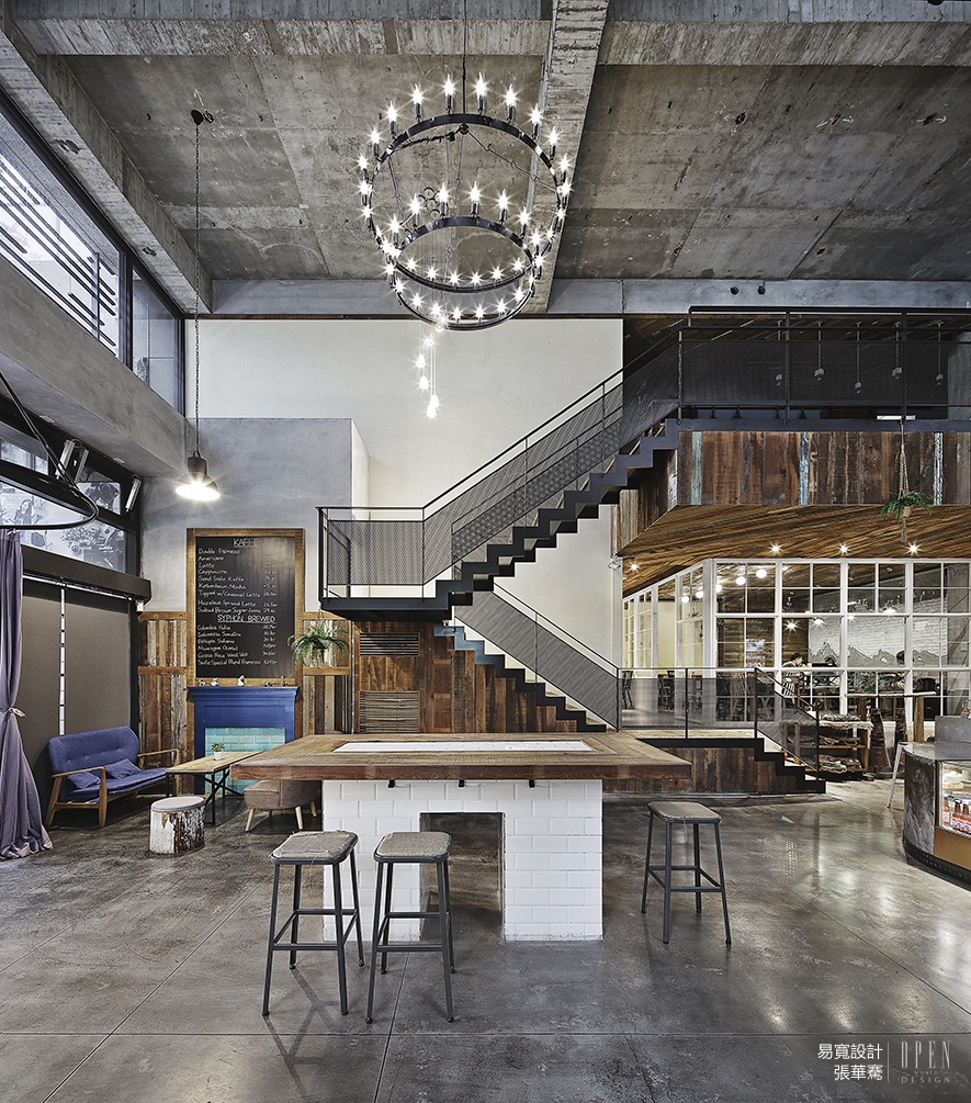
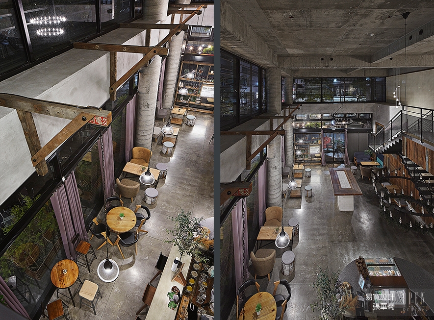 Hygge是一種日常即可感受到幸福的狀態,無需刻意安排,而是用心營造。延續這樣的意念,我們保留基地原有的水泥質感,並利用回收的舊木料加工,透過大面採光及挑空形體,達到場域間的連結和流動,形塑都市叢林中的自然寫意。而作為企業代表色的普魯士藍,也隱約注入其中——從室外的雨遮、牆面LOGO,及至室內的沙發、塗漆,皆點綴一抹朝氣,空間於有形無形間,靜靜的流淌品牌意念。
"Hygge" is a state in which happiness can be felt in the ordinary days, there is no need to arrange deliberately but to create a cozy space with heart. Follow the ideology; we retain the original cement texture of the building, and processing with exploiting the recycled wood. By way of the large area lighting and the hollow pattern, thence construct excellent connection and flowing, as well shapes the natural implication in the urban jungle. Prussian blue as the representative color of the enterprise, which apply on the outdoors canopy, the LOGO on the metope and the indoor sofa. All above embellished with a touch of vivacity in the whole space, moreover lightly emits the notion of the brand.
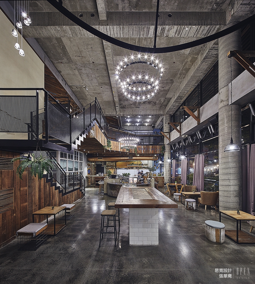
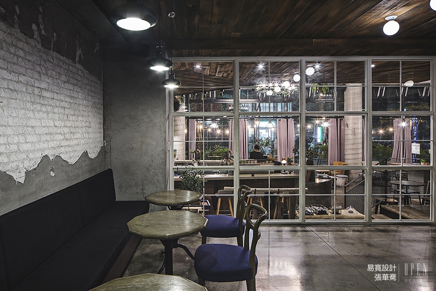
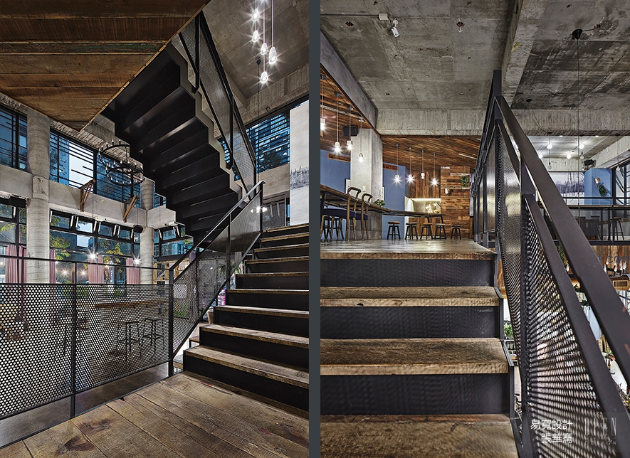
 因應基地原有的挑高優勢,我們在天花板上劃設了挑空形體,再利用樓梯串聯三個不同高程的空間,營造出場域間的連結性。
Take the advantage of the hollowed high ceiling pattern of the original building, and then make use of stairs to connect three different elevations of the space.
一樓櫃台銜接入口處的長桌,組合而成空間中的軸線,扮演著服務及互動的角色;馬蹄型的吧台設計,亦在收放之間呼應了共享的生活態度。而特別劃設出來的平台閣樓,以穿透的玻璃隔間作為過度區域,連接至二樓餐區;於此的座位配置,應合空間動線做了方向性的轉折,並輔以天花板的斜拼木料,增添視覺上的豐富層次。
Then pay attention to the especially constructed platform loft is connected to the dining area on the second floor with the penetrating glass compartment as the transitional area. The seats here make a directional turning to cooperate the flow of the space. The oblique splice wood plates of the ceiling that add rich layering of vision. Additionally set up the to-go window and exterior seating area, thence coordinate each region to acquire the unique spatial experience, moreover keeps the interaction, and spreads the original intention of the brand to every corner of the space.
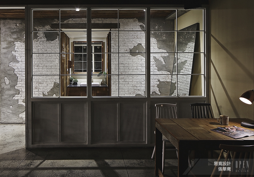
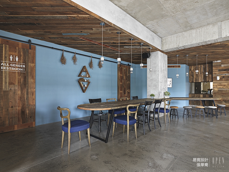
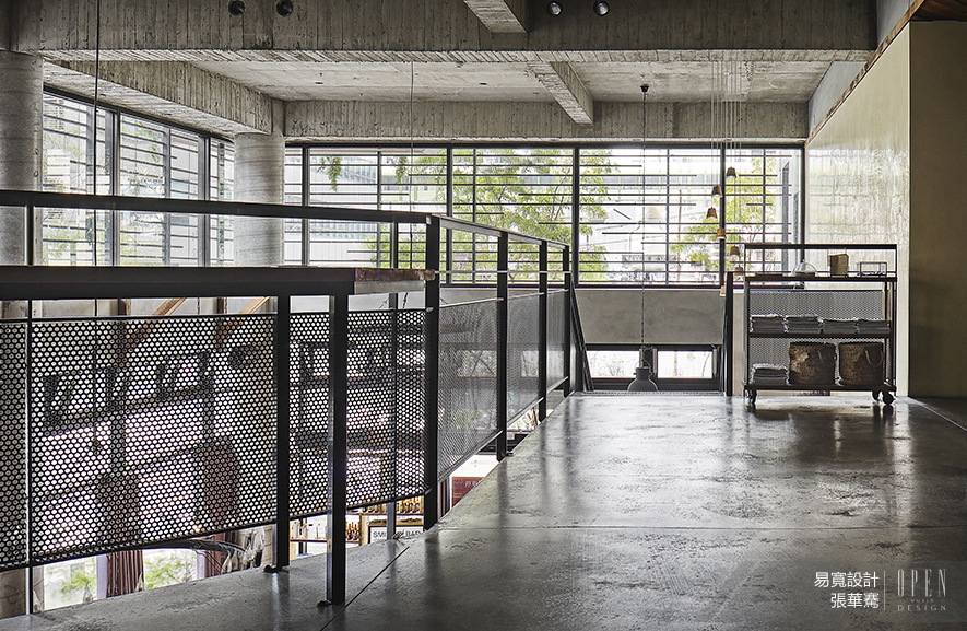 空間基底上則保留樓板拆模後的原有樣貌,及砌磚後的手磨質感,透過回收加工的舊木料及吧檯的水泥漫光、木板上的手工噴字,賦予建材新的生命,將「Hygge」拒絕過多鋪張及浪費的精神象徵挹注其中,擁抱生活本質,放慢步調,感受片刻美好。
By way of processing the recycled used wood; the diffusing light of the bar; the manual spraying words on the planks; endow the building materials a new life. Further to spread the "Hygge" spirit such like refusing excessive extravagance and waste in the whole space. In here, attempt to embrace the essence of life, slow down and readjust yourself as for to own a comfy leisure time.
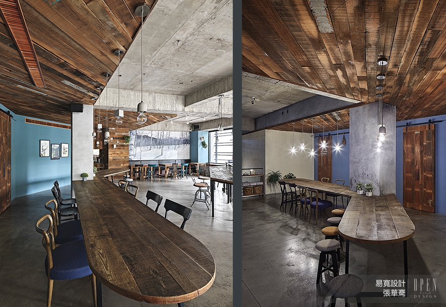 漫長的冬日讓丹麥人待在家的時間相對地長,因應氣候所帶來的陰鬱寒冷,他們更加講求居家佈置的燈光及氛圍營造。於是,我們在一樓樓面除了利用大面積的自然採光,也特別揀選了形似燭火的環狀燈飾,與閣樓平台的白色格窗和二樓雪地壁畫,串連而成「Hygge」的風格情境。
The long--term winter in North Europe relatively keep people to stay at home, for the purpose of conquer the gloomy and icy perception that caused by the climate, they are much more concerned about the home furnishing lighting and heartwarming ambience. Besides the large area of natural sunlight on the first floor, in particular, arranged the annular lightings of candle shape on the second floor that coordinate with the white loft terrace and the snow mural, which bring about a series of "Hygge" situations. After the removal of shuttering, retained the original appearance and the brick laid hand-grinding texture.
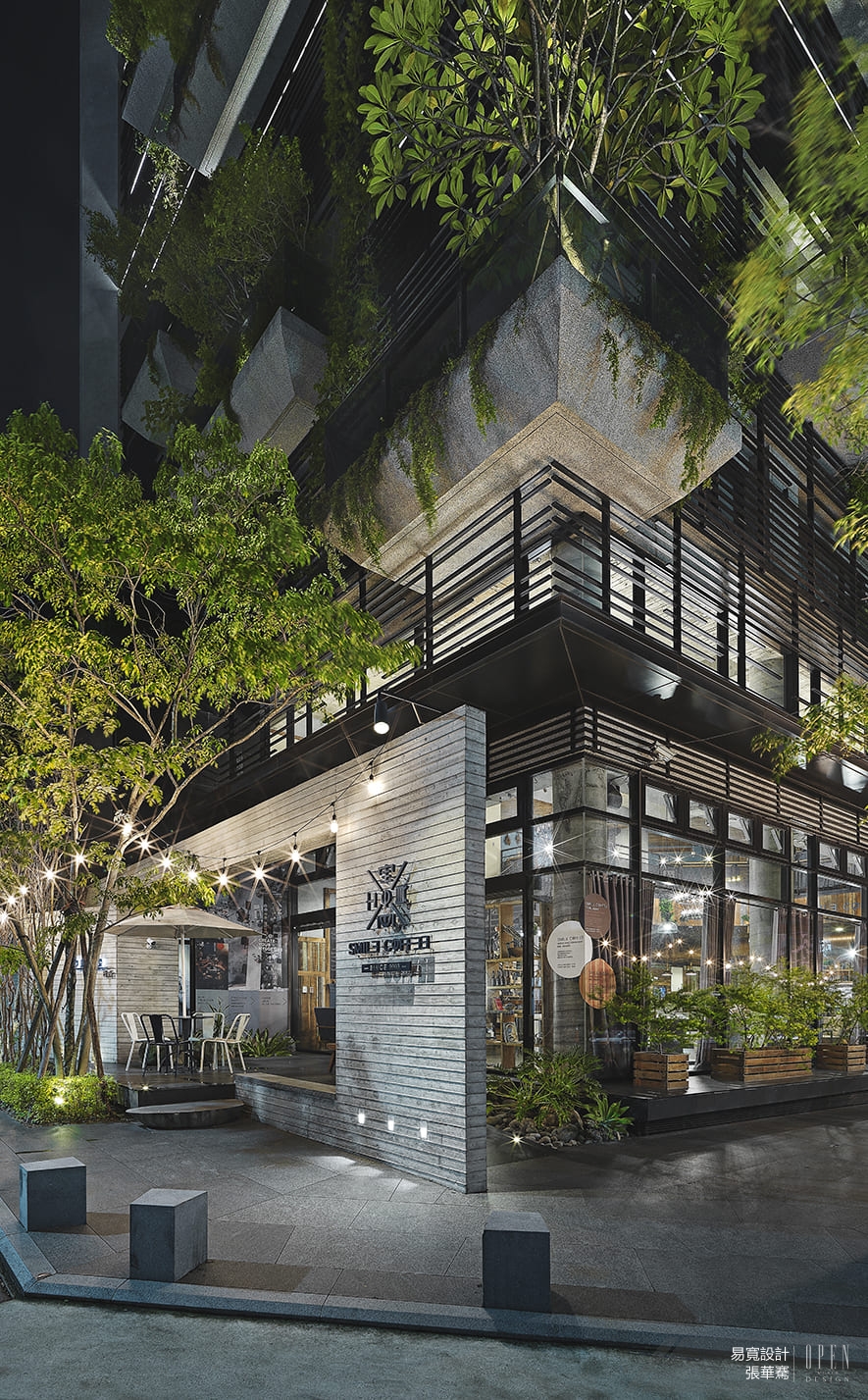
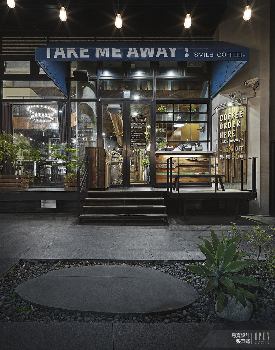 我們另外在戶外增設了外帶窗口及座位區,希望讓每一個區域都擁有獨特的空間體驗,卻又同時保有互動性,將品牌初衷散佈至空間各角落。
Additionally set up the to-go window and exterior seating area, thence coordinate each region to acquire the unique spatial experience, moreover keeps the interaction, and spreads the original intention of the brand to every corner of the space.






 動能開啟傳媒有限公司版權所有 COPYRIGHT © OPEN WORLD DESIGN ASSOCIATION RESERVED.
